 Our online courses
 HTML/CSS
 JavaScript
'%3e%3cpath%20d='M23.5602%2010.93L13.0602%200.430002C12.774%200.158498%2012.3946%200.00714111%2012.0002%200.00714111C11.6057%200.00714111%2011.2263%200.158498%2010.9402%200.430002L8.94018%202.43C8.89332%202.47648%208.85612%202.53178%208.83074%202.59271C8.80535%202.65364%208.79228%202.719%208.79228%202.785C8.79228%202.85101%208.80535%202.91636%208.83074%202.97729C8.85612%203.03822%208.89332%203.09352%208.94018%203.14L10.7402%205C10.8095%205.06923%2010.8977%205.11656%2010.9937%205.13611C11.0897%205.15567%2011.1893%205.14659%2011.2802%205.11C11.5851%204.99232%2011.9142%204.95115%2012.2387%204.9901C12.5632%205.02905%2012.8732%205.14693%2013.1416%205.33342C13.41%205.51992%2013.6286%205.76934%2013.7782%206.05988C13.9279%206.35041%2014.0041%206.6732%2014.0002%207C13.9976%207.25396%2013.9467%207.5051%2013.8502%207.74C13.8136%207.83089%2013.8045%207.93052%2013.8241%208.02652C13.8436%208.12253%2013.891%208.21067%2013.9602%208.28L15.7202%2010C15.7895%2010.0692%2015.8777%2010.1166%2015.9737%2010.1361C16.0697%2010.1557%2016.1693%2010.1466%2016.2602%2010.11C16.6565%209.95224%2017.0928%209.9253%2017.5055%2010.0331C17.9182%2010.1409%2018.2856%2010.3779%2018.554%2010.7093C18.8225%2011.0407%2018.978%2011.4493%2018.9978%2011.8754C19.0176%2012.3014%2018.9006%2012.7227%2018.664%2013.0776C18.4274%2013.4325%2018.0836%2013.7024%2017.6827%2013.848C17.2818%2013.9936%2016.8448%2014.0073%2016.4356%2013.8869C16.0264%2013.7666%2015.6664%2013.5185%2015.4082%2013.1791C15.1499%2012.8396%2015.007%2012.4265%2015.0002%2012C15.0033%2011.7568%2015.0507%2011.5162%2015.1402%2011.29C15.1747%2011.2004%2015.1826%2011.1028%2015.1631%2011.0088C15.1436%2010.9148%2015.0975%2010.8285%2015.0302%2010.76L13.3502%209.07C13.2803%209.00148%2013.1918%208.95498%2013.0958%208.93626C12.9997%208.91754%2012.9003%208.92742%2012.8098%208.96469C12.7193%209.00195%2012.6417%209.06496%2012.5867%209.14589C12.5316%209.22683%2012.5016%209.32214%2012.5002%209.42V14.7C12.4998%2014.7976%2012.5281%2014.8931%2012.5814%2014.9749C12.6347%2015.0566%2012.7107%2015.121%2012.8002%2015.16C13.2213%2015.3438%2013.5663%2015.667%2013.7772%2016.0752C13.988%2016.4835%2014.0519%2016.9519%2013.958%2017.4017C13.8641%2017.8514%2013.6182%2018.2552%2013.2617%2018.545C12.9051%2018.8348%2012.4597%2018.993%2012.0002%2018.993C11.5407%2018.993%2011.0952%2018.8348%2010.7387%2018.545C10.3821%2018.2552%2010.1362%2017.8514%2010.0424%2017.4017C9.9485%2016.9519%2010.0124%2016.4835%2010.2232%2016.0752C10.4341%2015.667%2010.7791%2015.3438%2011.2002%2015.16C11.2896%2015.121%2011.3657%2015.0566%2011.419%2014.9749C11.4723%2014.8931%2011.5005%2014.7976%2011.5002%2014.7V9.28C11.5005%209.18242%2011.4723%209.08687%2011.419%209.00513C11.3657%208.92339%2011.2896%208.85904%2011.2002%208.82C10.7271%208.61271%2010.3526%208.23047%2010.1551%207.7533C9.95748%207.27612%209.95215%206.74102%2010.1402%206.26C10.171%206.16762%2010.1742%206.06826%2010.1493%205.97411C10.1244%205.87995%2010.0726%205.79511%2010.0002%205.73L8.19018%203.88C8.1437%203.83314%208.0884%203.79594%208.02747%203.77056C7.96654%203.74517%207.90119%203.7321%207.83518%203.7321C7.76918%203.7321%207.70383%203.74517%207.6429%203.77056C7.58197%203.79594%207.52667%203.83314%207.48018%203.88L0.480184%2010.88C0.199283%2011.1613%200.0415039%2011.5425%200.0415039%2011.94C0.0415039%2012.3375%200.199283%2012.7188%200.480184%2013L10.9802%2023.51C11.2614%2023.7909%2011.6427%2023.9487%2012.0402%2023.9487C12.4377%2023.9487%2012.8189%2023.7909%2013.1002%2023.51L23.6002%2013C23.8811%2012.7188%2024.0389%2012.3375%2024.0389%2011.94C24.0389%2011.5425%2023.8811%2011.1613%2023.6002%2010.88L23.5602%2010.93Z'%20fill='white'/%3e%3c/g%3e%3cdefs%3e%3cclipPath%20id='clip0_1481_6122'%3e%3crect%20width='24'%20height='24'%20fill='white'/%3e%3c/clipPath%3e%3c/defs%3e%3c/svg%3e) Git
Git'%3e%3cpath%20d='M16.6011%202.00588H15.7556L15.7372%201.99342C15.0469%201.51665%2013.7032%200.590486%2011.8634%200.855279C11.8664%200.859491%2011.8678%200.864404%2011.8706%200.868615C10.5059%201.09463%208.97767%202.15872%208.46774%203.59394C7.97588%204.97669%208.35649%206.63985%209.60026%208.53868L11.5022%2011.4449C14.3783%2010.0069%2014.2755%207.81624%2014.2142%206.50737C14.2051%206.31452%2014.1991%206.17502%2014.1991%206.05113C14.1991%205.67842%2014.5008%205.37695%2014.8733%205.37695C15.246%205.37695%2015.5475%205.67842%2015.5475%206.05113C15.5475%206.15589%2015.5535%206.27433%2015.5594%206.40278C15.6279%207.8645%2015.7661%2010.8206%2012.1054%2012.651C11.8769%2012.7654%2011.4979%2012.9909%2011.2673%2012.9909C11.046%2012.9909%2010.8307%2012.8822%2010.7024%2012.6861L8.47178%209.27743C6.98567%207.00712%206.55645%204.943%207.19694%203.14226C7.3396%202.7413%207.53614%202.39631%207.75057%202.07572C3.41438%202.59969%200.00470058%206.30276%200.0029458%2010.8679C-0.0130225%2011.5476%20-0.0270607%2013.6156%201.77508%2016.2716C2.40451%2017.2%202.73774%2018.3601%202.73774%2019.6268V21.558C2.73774%2021.9307%203.03921%2022.2321%203.41192%2022.2321H6.10864C6.48135%2022.2321%206.77387%2021.9307%206.77387%2021.558V18.1869H9.47971V21.558C9.47971%2021.9307%209.78136%2022.2321%2010.1541%2022.2321H12.8508C13.2235%2022.2321%2013.516%2021.9307%2013.516%2021.558C13.516%2018.9434%2014.0603%2016.6015%2015.1625%2014.3978L15.9283%2012.8663L17.2293%2013.083C18.2082%2013.2462%2018.9187%2014.085%2018.9187%2015.078V16.1643C18.9187%2016.7167%2018.1609%2017.0328%2017.7678%2016.6409C17.5046%2016.3776%2017.0778%2016.3776%2016.8144%2016.6409L14.9089%2018.5464C14.6457%2018.8098%2014.6457%2019.2364%2014.9089%2019.4998C16.0501%2020.6421%2017.6769%2021.1082%2019.2571%2020.7462C21.2666%2020.2859%2023%2018.0539%2023%2015.8725V8.36864C23%204.86%2020.1099%202.00588%2016.6011%202.00588ZM18.2446%208.74802C17.8724%208.74802%2017.5704%208.44603%2017.5704%208.07367C17.5704%207.70131%2017.8724%207.39949%2018.2446%207.39949C18.6169%207.39949%2018.9189%207.70131%2018.9189%208.07367C18.9189%208.44603%2018.6169%208.74802%2018.2446%208.74802Z'%20fill='white'/%3e%3c/g%3e%3cdefs%3e%3cclipPath%20id='clip0_1481_6112'%3e%3crect%20width='23'%20height='23'%20fill='white'/%3e%3c/clipPath%3e%3c/defs%3e%3c/svg%3e) PHP
PHP Freelance
'%3e%3cpath%20d='M1.41413%2011.974C1.49937%2011.9879%201.58563%2011.9944%201.67193%2011.9932L16.3679%2011.9933L16.0474%2012.1435C15.7342%2012.293%2015.4492%2012.4964%2015.2053%2012.7445L11.0842%2016.899C10.5414%2017.4214%2010.4502%2018.2616%2010.8681%2018.8899C11.3544%2019.5594%2012.287%2019.7048%2012.9512%2019.2145C13.0048%2019.1749%2013.0558%2019.1317%2013.1038%2019.0852L20.556%2011.5725C21.1384%2010.9861%2021.1389%2010.0347%2020.5572%209.44762C20.5568%209.44725%2020.5564%209.44682%2020.556%209.44645L13.1038%201.93376C12.5209%201.34781%2011.5772%201.34913%2010.9959%201.93671C10.9502%201.98296%2010.9075%202.03217%2010.8681%202.08401C10.4502%202.7123%2010.5414%203.55255%2011.0842%204.07487L15.1978%208.2369C15.4165%208.45759%2015.6679%208.64264%2015.9431%208.78533L16.3902%208.98817L1.75396%208.98817C0.992568%208.95967%200.324563%209.49584%200.181527%2010.2503C0.0497616%2011.0694%200.601603%2011.8411%201.41413%2011.974Z'%20fill='white'/%3e%3c/g%3e%3cdefs%3e%3cclipPath%20id='clip0_520_10'%3e%3crect%20width='20.8311'%20height='21'%20fill='white'%20transform='translate(20.9932%2021)%20rotate(-180)'/%3e%3c/clipPath%3e%3c/defs%3e%3c/svg%3e)
'%3e%3cpath%20d='M50.2142%2018.9386C49.891%2017.9389%2049.0043%2017.2289%2047.9552%2017.1343L33.7053%2015.8404L28.0704%202.65157C27.655%201.685%2026.7087%201.05933%2025.6574%201.05933C24.6061%201.05933%2023.6599%201.685%2023.2444%202.65383L17.6096%2015.8404L3.35734%2017.1343C2.31016%2017.2311%201.42571%2017.9389%201.10063%2018.9386C0.775554%2019.9383%201.07577%2021.0349%201.86794%2021.7261L12.6392%2031.1726L9.46301%2045.1637C9.2306%2046.1924%209.62988%2047.2558%2010.4834%2047.8728C10.9423%2048.2043%2011.479%2048.3731%2012.0203%2048.3731C12.487%2048.3731%2012.95%2048.2473%2013.3655%2047.9986L25.6574%2040.6522L37.9448%2047.9986C38.844%2048.5396%2039.9774%2048.4902%2040.8291%2047.8728C41.683%2047.2539%2042.0819%2046.1902%2041.8495%2045.1637L38.6733%2031.1726L49.4446%2021.728C50.2368%2021.0349%2050.5393%2019.9402%2050.2142%2018.9386Z'%20fill='%23FFC107'/%3e%3c/g%3e%3cdefs%3e%3cclipPath%20id='clip0_1229_10547'%3e%3crect%20width='49.3714'%20height='49.3714'%20fill='white'%20transform='translate(0.971436)'/%3e%3c/clipPath%3e%3c/defs%3e%3c/svg%3e)
'%3e%3cpath%20d='M18.6283%2023.5149C18.8912%2023.5149%2019.1524%2023.4328%2019.3752%2023.2717C19.7903%2022.9708%2019.9842%2022.4537%2019.8712%2021.9548L18.3273%2015.1535L23.5635%2010.5615C23.9484%2010.2255%2024.0954%209.69335%2023.9374%209.20646C23.7794%208.72049%2023.3494%208.37642%2022.8404%208.32936L15.9122%207.70038L13.1731%201.29024C12.9711%200.819283%2012.5111%200.515137%2012.0001%200.515137C11.489%200.515137%2011.029%200.819283%2010.8271%201.28914L8.08792%207.70038L1.16086%208.32936C0.650715%208.37532%200.220772%208.72049%200.062748%209.20646C-0.0952761%209.69243%200.0508457%2010.2255%200.435743%2010.5615L5.67196%2015.1526L4.12798%2021.9537C4.01482%2022.4537%204.20891%2022.9708%204.62384%2023.2708C5.03785%2023.5707%205.58993%2023.5938%206.02592%2023.3318L12.0001%2019.7617L17.9742%2023.3338C18.1762%2023.4537%2018.4012%2023.5149%2018.6283%2023.5149ZM12.0001%2018C12%2017.7763%2012.0001%2017.5%2012.0001%2017.5V17V16C12%2015.5%2012%2015%2012.0001%2014.5V12.5V11.5C12%2011%2012.0001%209.18247%2012.0001%209.18247V2.36217L14.5852%208.41231C14.7672%208.84335%2015.1723%209.13944%2015.6421%209.18247L22.1843%209.77648L17.2403%2014.1125C16.8862%2014.4225%2016.7313%2014.8986%2016.8362%2015.3566L18.2923%2021.7757L12.6541%2018.4046C12.4522%2018.2847%2012.0001%2018%2012.0001%2018Z'%20fill='%23FFC107'/%3e%3c/g%3e%3cdefs%3e%3cclipPath%20id='clip0_1843_3872'%3e%3crect%20width='24'%20height='24'%20fill='white'%20transform='matrix(-1%200%200%201%2024%200)'/%3e%3c/clipPath%3e%3c/defs%3e%3c/svg%3e) 4.8 average rating
4.8 average rating
# Introduction to Web Accessibility: The Issue of Colors

NicolasBrondinBernard
Hello, let me introduce myself: Nicolas, colorblind for 26 years, today we're going to talk about colors!

Article published on 09/10/2020, last updated on 10/08/2026
When talking about best practices on the web, we see an acronym becoming essential today: A11Y
A11Y stands for "accessibility", the number 11 representing the number of letters between the starting "a" and the ending "y".
The accessibility of a website represents the possibility for anyone to access it without any trouble, regardless of their equipment, their age, their disability, etc...
The topic of accessibility is very vast but it is very important in order to avoid reproducing everyday inequalities in the digital life of millions of people.
Today, we are going to talk about a very specific accessibility topic, which is that of colors, what they imply in terms of comprehension, ease of reading, etc...
The choice of colors and color blindness
This isn't often the first topic that comes up when talking about web accessibility, but for my part it was the topic I felt most comfortable with to start this series of articles, given that I am colorblind myself!
For those who might not fully understand what color blindness is, it can be described as a genetic mutation (most of the time), affecting color vision.
There are several types of color blindness depending on the color hues affected, but what you need to remember is that color blindness affects 8% of men and 0.4% of women, which ultimately makes up a good portion of the world's population.
Since I know that many people have a hard time picturing the real consequences of color blindness on eyesight, here are two visual aids:
The image below is a color blindness test, given to children. If you can see the number "9" in the image, you are not affected, but if you can't perceive it, you might be colorblind (sorry if you're finding out today).
As for me, even putting my whole heart into it I don't see any number, so thanks to my wife for helping me choose this image!
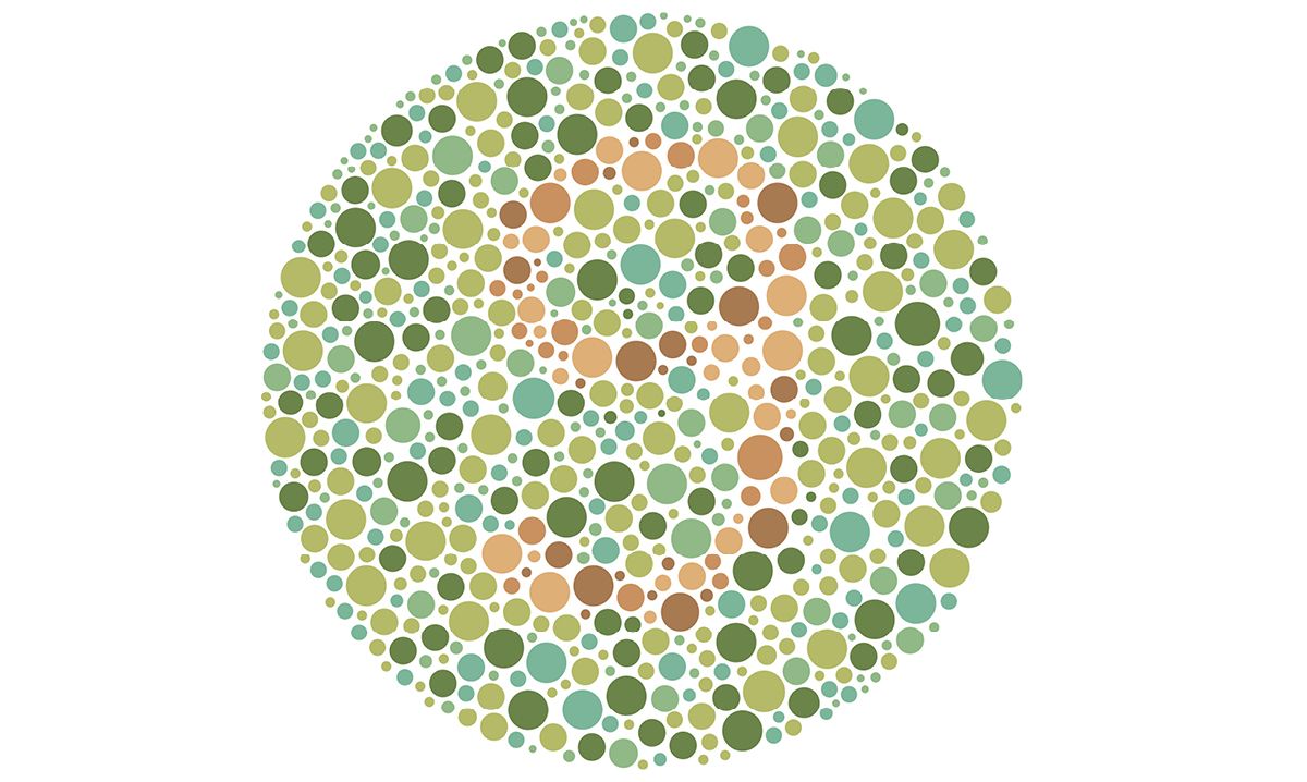
But a single circle like this one isn't enough to determine your color blindness, because there are 3 main types in total, two of which are subdivided into three subtypes, each one affecting a different color: red, green, or blue.
To help you get a sense of it, here is the representation of three different color blindness subtypes applied to a reference image:
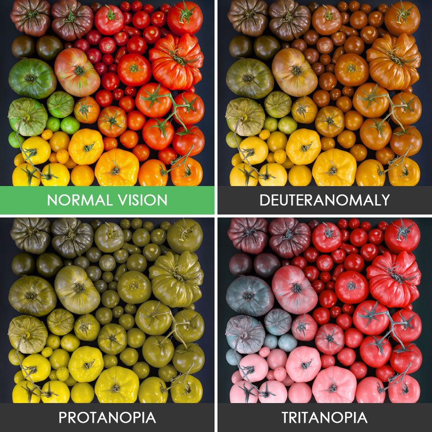
Personally I have trouble seeing the difference between the first and second image since I am Deuteranomalous.
You're probably starting to understand the stakes of colors on your websites: by using certain colors together, you risk preventing some people from understanding all the information you're trying to convey.
Contrasts
When you write text, always keep in mind that just because it's readable for you doesn't mean it's readable for everyone.
The choice of background and text colors is very important because depending on the hues used, they can make text completely unreadable for some people, or sometimes cause headaches if the person has to concentrate very hard in order to finish reading.
Another consequence of a poor contrast choice can even be to convey the wrong information!
Take a button whose background color you change upon activation, if the contrast between the two states isn't strong enough, the user won't necessarily understand that their click worked, and might click again by mistake.
To avoid this kind of problem, you can use tools like WebAIM's "Contrast Checker" available here: https://webaim.org/resources/contrastchecker/
Visual aids
While in the collective unconscious, it's easy to understand the difference in connotation between red text and green text, a colorblind person with a deficiency affecting one of these two colors might not understand the difference.
In the context of a quiz for example, distinguishing a correct answer from a wrong one using only colors is a bad idea. The ideal approach is to add visual aids in order to eliminate any ambiguity.
A visual aid can be an icon, a text, a shape, a sound (be careful that it remains accessible for hard-of-hearing people), or anything that can reinforce the original information.
The answer was the capybara --> Not good
Correct: The answer was the capybara --> Better
✓ Correct: The answer was the capybara --> Perfect
In the example above, some people won't be able to know their result with the first version, unlike the other two!
Some think that as a developer, design is not their responsibility, however ensuring accessibility will always be our responsibility, even if we sometimes only serve as safeguards for the designs presented to us!
Note
Color-related accessibility issues are not limited only to colorblind people but also to all people with reduced visual acuity, but this is a part that will be covered at greater length in a future article, where we'll talk about readability in general.
I hope you enjoyed this article, and see you soon on the blog!
 Our newsletter
'%3e%3cpath%20fill-rule='evenodd'%20clip-rule='evenodd'%20d='M72.5155%2012.5718C75.6945%2015.8057%2078.2525%2019.5301%2080.1125%2023.679C81.3145%2026.3623%2082.3435%2029.1243%2083.4505%2031.8492C83.6375%2032.3111%2083.7765%2032.8053%2084.0355%2033.2246C84.6475%2034.2217%2085.7315%2034.5465%2086.8145%2034.1274C87.8715%2033.7195%2088.3955%2032.7253%2088.1515%2031.5451C88.0755%2031.1786%2087.9465%2030.8219%2087.8105%2030.4722C86.9775%2028.3103%2086.1515%2026.1476%2085.2915%2023.9968C83.1765%2018.7014%2080.1335%2013.9697%2076.2523%209.82479C72.7447%206.07839%2068.6287%203.12639%2063.7022%201.48819C57.4127%20-0.603812%2051.2075%20-0.547513%2044.9948%202.02189C39.4996%204.29209%2035.0439%207.73379%2031.711%2012.6458C31.5036%2012.9502%2031.2574%2013.2266%2031.0268%2013.5179C29.915%2013.4715%2028.8561%2013.3969%2027.7982%2013.3869C22.9432%2013.3447%2018.3994%2014.7386%2013.967%2016.5243C9.59841%2018.2828%205.56591%2020.6962%201.54961%2023.131C1.23141%2023.325%200.904509%2023.5281%200.643609%2023.7892C-0.0963912%2024.5355%20-0.200491%2025.6562%200.342808%2026.5603C0.828308%2027.3659%201.83521%2027.8%202.78011%2027.5321C3.25281%2027.3987%203.70351%2027.1552%204.13371%2026.9099C5.82041%2025.9496%207.49191%2024.9658%209.17171%2023.9963C13.5938%2021.4452%2018.2545%2019.5026%2023.2628%2018.4322C24.9852%2018.0641%2026.7172%2017.9384%2028.7371%2018.038C28.4581%2018.917%2028.271%2019.5699%2028.0472%2020.2096C26.67%2024.1467%2026.5267%2028.1778%2027.1522%2032.2608C27.6029%2035.2162%2028.8732%2037.7537%2031.2161%2039.6622C33.4854%2041.5118%2036.0875%2041.9447%2038.8101%2040.9617C41.0438%2040.156%2042.8658%2038.6736%2044.0441%2036.5888C46.8425%2031.6348%2047.0464%2026.603%2044.2229%2021.5701C42.7367%2018.9202%2040.5312%2017.0235%2037.8341%2015.6694C37.237%2015.3705%2036.645%2015.0612%2036.0884%2014.7741C36.1468%2014.5219%2036.1423%2014.3816%2036.2057%2014.2889C36.4175%2013.9774%2036.6413%2013.675%2036.879%2013.3854C39.3546%2010.384%2042.3928%208.17019%2045.9575%206.58539C50.4698%204.57989%2055.0793%204.08149%2059.8924%205.16149C64.8992%206.28519%2068.9941%208.99209%2072.5155%2012.5718ZM41.594%2029.1476C41.5152%2030.918%2041.1023%2032.5993%2040.1694%2034.1291C39.5697%2035.114%2038.7683%2035.8803%2037.7415%2036.3967C36.28%2037.1301%2034.9842%2036.9271%2033.7986%2035.8031C32.6715%2034.7343%2032.0038%2033.4128%2031.7388%2031.8996C31.0008%2027.6748%2031.4326%2023.5754%2033.1597%2019.6328C33.2535%2019.4133%2033.4078%2019.2186%2033.5245%2019.0287C38.275%2019.976%2041.8043%2024.4206%2041.594%2029.1476Z'%20fill='black'/%3e%3cpath%20fill-rule='evenodd'%20clip-rule='evenodd'%20d='M102.266%2020.8839C101.352%2020.2756%20100.13%2020.4026%2099.3588%2021.2292C99.0208%2021.5933%2098.7528%2022.026%2098.4788%2022.4428C96.5528%2025.3735%2094.6639%2028.3264%2092.6999%2031.2312C91.5439%2032.9398%2090.2908%2034.5849%2089.0488%2036.2335C88.6758%2036.7311%2088.2468%2037.2126%2087.7568%2037.5863C85.7018%2039.1532%2085.0969%2038.8619%2083.7259%2037.4394C82.5589%2036.2278%2081.4588%2034.9302%2080.4798%2033.5586C78.8108%2031.2187%2077.2609%2028.7911%2075.657%2026.4008C75.343%2025.9337%2075.0504%2025.4451%2074.6842%2025.0228C73.8576%2024.0693%2072.6388%2023.9134%2071.6428%2024.5858C70.7481%2025.1888%2070.4458%2026.3239%2070.908%2027.4234C71.0299%2027.7102%2071.1897%2027.9832%2071.3645%2028.2417C73.2453%2031.0478%2075.0782%2033.8887%2077.0405%2036.638C78.0899%2038.1092%2079.3228%2039.4556%2080.5508%2040.7855C81.4478%2041.7575%2082.5558%2042.4683%2083.8038%2042.9622C84.9038%2043.3991%2085.9788%2043.513%2087.1198%2043.0138C89.1478%2042.4708%2090.8458%2041.3176%2092.1638%2039.6644C93.5678%2037.9044%2094.9388%2036.1104%2096.2058%2034.251C98.3208%2031.1475%20100.341%2027.9792%20102.398%2024.8354C102.636%2024.4693%20102.888%2024.1036%20103.065%2023.7065C103.522%2022.6733%20103.169%2021.4844%20102.266%2020.8839Z'%20fill='black'/%3e%3c/g%3e%3cdefs%3e%3cclipPath%20id='clip0_1990_7380'%3e%3crect%20width='103'%20height='43'%20fill='white'/%3e%3c/clipPath%3e%3c/defs%3e%3c/svg%3e)

No spam. Only free content, news, and ever more resources to level up your skills!
 Join +1500 developers
No comments yet