 Our online courses
 HTML/CSS
 JavaScript
'%3e%3cpath%20d='M23.5602%2010.93L13.0602%200.430002C12.774%200.158498%2012.3946%200.00714111%2012.0002%200.00714111C11.6057%200.00714111%2011.2263%200.158498%2010.9402%200.430002L8.94018%202.43C8.89332%202.47648%208.85612%202.53178%208.83074%202.59271C8.80535%202.65364%208.79228%202.719%208.79228%202.785C8.79228%202.85101%208.80535%202.91636%208.83074%202.97729C8.85612%203.03822%208.89332%203.09352%208.94018%203.14L10.7402%205C10.8095%205.06923%2010.8977%205.11656%2010.9937%205.13611C11.0897%205.15567%2011.1893%205.14659%2011.2802%205.11C11.5851%204.99232%2011.9142%204.95115%2012.2387%204.9901C12.5632%205.02905%2012.8732%205.14693%2013.1416%205.33342C13.41%205.51992%2013.6286%205.76934%2013.7782%206.05988C13.9279%206.35041%2014.0041%206.6732%2014.0002%207C13.9976%207.25396%2013.9467%207.5051%2013.8502%207.74C13.8136%207.83089%2013.8045%207.93052%2013.8241%208.02652C13.8436%208.12253%2013.891%208.21067%2013.9602%208.28L15.7202%2010C15.7895%2010.0692%2015.8777%2010.1166%2015.9737%2010.1361C16.0697%2010.1557%2016.1693%2010.1466%2016.2602%2010.11C16.6565%209.95224%2017.0928%209.9253%2017.5055%2010.0331C17.9182%2010.1409%2018.2856%2010.3779%2018.554%2010.7093C18.8225%2011.0407%2018.978%2011.4493%2018.9978%2011.8754C19.0176%2012.3014%2018.9006%2012.7227%2018.664%2013.0776C18.4274%2013.4325%2018.0836%2013.7024%2017.6827%2013.848C17.2818%2013.9936%2016.8448%2014.0073%2016.4356%2013.8869C16.0264%2013.7666%2015.6664%2013.5185%2015.4082%2013.1791C15.1499%2012.8396%2015.007%2012.4265%2015.0002%2012C15.0033%2011.7568%2015.0507%2011.5162%2015.1402%2011.29C15.1747%2011.2004%2015.1826%2011.1028%2015.1631%2011.0088C15.1436%2010.9148%2015.0975%2010.8285%2015.0302%2010.76L13.3502%209.07C13.2803%209.00148%2013.1918%208.95498%2013.0958%208.93626C12.9997%208.91754%2012.9003%208.92742%2012.8098%208.96469C12.7193%209.00195%2012.6417%209.06496%2012.5867%209.14589C12.5316%209.22683%2012.5016%209.32214%2012.5002%209.42V14.7C12.4998%2014.7976%2012.5281%2014.8931%2012.5814%2014.9749C12.6347%2015.0566%2012.7107%2015.121%2012.8002%2015.16C13.2213%2015.3438%2013.5663%2015.667%2013.7772%2016.0752C13.988%2016.4835%2014.0519%2016.9519%2013.958%2017.4017C13.8641%2017.8514%2013.6182%2018.2552%2013.2617%2018.545C12.9051%2018.8348%2012.4597%2018.993%2012.0002%2018.993C11.5407%2018.993%2011.0952%2018.8348%2010.7387%2018.545C10.3821%2018.2552%2010.1362%2017.8514%2010.0424%2017.4017C9.9485%2016.9519%2010.0124%2016.4835%2010.2232%2016.0752C10.4341%2015.667%2010.7791%2015.3438%2011.2002%2015.16C11.2896%2015.121%2011.3657%2015.0566%2011.419%2014.9749C11.4723%2014.8931%2011.5005%2014.7976%2011.5002%2014.7V9.28C11.5005%209.18242%2011.4723%209.08687%2011.419%209.00513C11.3657%208.92339%2011.2896%208.85904%2011.2002%208.82C10.7271%208.61271%2010.3526%208.23047%2010.1551%207.7533C9.95748%207.27612%209.95215%206.74102%2010.1402%206.26C10.171%206.16762%2010.1742%206.06826%2010.1493%205.97411C10.1244%205.87995%2010.0726%205.79511%2010.0002%205.73L8.19018%203.88C8.1437%203.83314%208.0884%203.79594%208.02747%203.77056C7.96654%203.74517%207.90119%203.7321%207.83518%203.7321C7.76918%203.7321%207.70383%203.74517%207.6429%203.77056C7.58197%203.79594%207.52667%203.83314%207.48018%203.88L0.480184%2010.88C0.199283%2011.1613%200.0415039%2011.5425%200.0415039%2011.94C0.0415039%2012.3375%200.199283%2012.7188%200.480184%2013L10.9802%2023.51C11.2614%2023.7909%2011.6427%2023.9487%2012.0402%2023.9487C12.4377%2023.9487%2012.8189%2023.7909%2013.1002%2023.51L23.6002%2013C23.8811%2012.7188%2024.0389%2012.3375%2024.0389%2011.94C24.0389%2011.5425%2023.8811%2011.1613%2023.6002%2010.88L23.5602%2010.93Z'%20fill='white'/%3e%3c/g%3e%3cdefs%3e%3cclipPath%20id='clip0_1481_6122'%3e%3crect%20width='24'%20height='24'%20fill='white'/%3e%3c/clipPath%3e%3c/defs%3e%3c/svg%3e) Git
Git'%3e%3cpath%20d='M16.6011%202.00588H15.7556L15.7372%201.99342C15.0469%201.51665%2013.7032%200.590486%2011.8634%200.855279C11.8664%200.859491%2011.8678%200.864404%2011.8706%200.868615C10.5059%201.09463%208.97767%202.15872%208.46774%203.59394C7.97588%204.97669%208.35649%206.63985%209.60026%208.53868L11.5022%2011.4449C14.3783%2010.0069%2014.2755%207.81624%2014.2142%206.50737C14.2051%206.31452%2014.1991%206.17502%2014.1991%206.05113C14.1991%205.67842%2014.5008%205.37695%2014.8733%205.37695C15.246%205.37695%2015.5475%205.67842%2015.5475%206.05113C15.5475%206.15589%2015.5535%206.27433%2015.5594%206.40278C15.6279%207.8645%2015.7661%2010.8206%2012.1054%2012.651C11.8769%2012.7654%2011.4979%2012.9909%2011.2673%2012.9909C11.046%2012.9909%2010.8307%2012.8822%2010.7024%2012.6861L8.47178%209.27743C6.98567%207.00712%206.55645%204.943%207.19694%203.14226C7.3396%202.7413%207.53614%202.39631%207.75057%202.07572C3.41438%202.59969%200.00470058%206.30276%200.0029458%2010.8679C-0.0130225%2011.5476%20-0.0270607%2013.6156%201.77508%2016.2716C2.40451%2017.2%202.73774%2018.3601%202.73774%2019.6268V21.558C2.73774%2021.9307%203.03921%2022.2321%203.41192%2022.2321H6.10864C6.48135%2022.2321%206.77387%2021.9307%206.77387%2021.558V18.1869H9.47971V21.558C9.47971%2021.9307%209.78136%2022.2321%2010.1541%2022.2321H12.8508C13.2235%2022.2321%2013.516%2021.9307%2013.516%2021.558C13.516%2018.9434%2014.0603%2016.6015%2015.1625%2014.3978L15.9283%2012.8663L17.2293%2013.083C18.2082%2013.2462%2018.9187%2014.085%2018.9187%2015.078V16.1643C18.9187%2016.7167%2018.1609%2017.0328%2017.7678%2016.6409C17.5046%2016.3776%2017.0778%2016.3776%2016.8144%2016.6409L14.9089%2018.5464C14.6457%2018.8098%2014.6457%2019.2364%2014.9089%2019.4998C16.0501%2020.6421%2017.6769%2021.1082%2019.2571%2020.7462C21.2666%2020.2859%2023%2018.0539%2023%2015.8725V8.36864C23%204.86%2020.1099%202.00588%2016.6011%202.00588ZM18.2446%208.74802C17.8724%208.74802%2017.5704%208.44603%2017.5704%208.07367C17.5704%207.70131%2017.8724%207.39949%2018.2446%207.39949C18.6169%207.39949%2018.9189%207.70131%2018.9189%208.07367C18.9189%208.44603%2018.6169%208.74802%2018.2446%208.74802Z'%20fill='white'/%3e%3c/g%3e%3cdefs%3e%3cclipPath%20id='clip0_1481_6112'%3e%3crect%20width='23'%20height='23'%20fill='white'/%3e%3c/clipPath%3e%3c/defs%3e%3c/svg%3e) PHP
PHP Freelance
'%3e%3cpath%20d='M1.41413%2011.974C1.49937%2011.9879%201.58563%2011.9944%201.67193%2011.9932L16.3679%2011.9933L16.0474%2012.1435C15.7342%2012.293%2015.4492%2012.4964%2015.2053%2012.7445L11.0842%2016.899C10.5414%2017.4214%2010.4502%2018.2616%2010.8681%2018.8899C11.3544%2019.5594%2012.287%2019.7048%2012.9512%2019.2145C13.0048%2019.1749%2013.0558%2019.1317%2013.1038%2019.0852L20.556%2011.5725C21.1384%2010.9861%2021.1389%2010.0347%2020.5572%209.44762C20.5568%209.44725%2020.5564%209.44682%2020.556%209.44645L13.1038%201.93376C12.5209%201.34781%2011.5772%201.34913%2010.9959%201.93671C10.9502%201.98296%2010.9075%202.03217%2010.8681%202.08401C10.4502%202.7123%2010.5414%203.55255%2011.0842%204.07487L15.1978%208.2369C15.4165%208.45759%2015.6679%208.64264%2015.9431%208.78533L16.3902%208.98817L1.75396%208.98817C0.992568%208.95967%200.324563%209.49584%200.181527%2010.2503C0.0497616%2011.0694%200.601603%2011.8411%201.41413%2011.974Z'%20fill='white'/%3e%3c/g%3e%3cdefs%3e%3cclipPath%20id='clip0_520_10'%3e%3crect%20width='20.8311'%20height='21'%20fill='white'%20transform='translate(20.9932%2021)%20rotate(-180)'/%3e%3c/clipPath%3e%3c/defs%3e%3c/svg%3e)
'%3e%3cpath%20d='M50.2142%2018.9386C49.891%2017.9389%2049.0043%2017.2289%2047.9552%2017.1343L33.7053%2015.8404L28.0704%202.65157C27.655%201.685%2026.7087%201.05933%2025.6574%201.05933C24.6061%201.05933%2023.6599%201.685%2023.2444%202.65383L17.6096%2015.8404L3.35734%2017.1343C2.31016%2017.2311%201.42571%2017.9389%201.10063%2018.9386C0.775554%2019.9383%201.07577%2021.0349%201.86794%2021.7261L12.6392%2031.1726L9.46301%2045.1637C9.2306%2046.1924%209.62988%2047.2558%2010.4834%2047.8728C10.9423%2048.2043%2011.479%2048.3731%2012.0203%2048.3731C12.487%2048.3731%2012.95%2048.2473%2013.3655%2047.9986L25.6574%2040.6522L37.9448%2047.9986C38.844%2048.5396%2039.9774%2048.4902%2040.8291%2047.8728C41.683%2047.2539%2042.0819%2046.1902%2041.8495%2045.1637L38.6733%2031.1726L49.4446%2021.728C50.2368%2021.0349%2050.5393%2019.9402%2050.2142%2018.9386Z'%20fill='%23FFC107'/%3e%3c/g%3e%3cdefs%3e%3cclipPath%20id='clip0_1229_10547'%3e%3crect%20width='49.3714'%20height='49.3714'%20fill='white'%20transform='translate(0.971436)'/%3e%3c/clipPath%3e%3c/defs%3e%3c/svg%3e)
'%3e%3cpath%20d='M18.6283%2023.5149C18.8912%2023.5149%2019.1524%2023.4328%2019.3752%2023.2717C19.7903%2022.9708%2019.9842%2022.4537%2019.8712%2021.9548L18.3273%2015.1535L23.5635%2010.5615C23.9484%2010.2255%2024.0954%209.69335%2023.9374%209.20646C23.7794%208.72049%2023.3494%208.37642%2022.8404%208.32936L15.9122%207.70038L13.1731%201.29024C12.9711%200.819283%2012.5111%200.515137%2012.0001%200.515137C11.489%200.515137%2011.029%200.819283%2010.8271%201.28914L8.08792%207.70038L1.16086%208.32936C0.650715%208.37532%200.220772%208.72049%200.062748%209.20646C-0.0952761%209.69243%200.0508457%2010.2255%200.435743%2010.5615L5.67196%2015.1526L4.12798%2021.9537C4.01482%2022.4537%204.20891%2022.9708%204.62384%2023.2708C5.03785%2023.5707%205.58993%2023.5938%206.02592%2023.3318L12.0001%2019.7617L17.9742%2023.3338C18.1762%2023.4537%2018.4012%2023.5149%2018.6283%2023.5149ZM12.0001%2018C12%2017.7763%2012.0001%2017.5%2012.0001%2017.5V17V16C12%2015.5%2012%2015%2012.0001%2014.5V12.5V11.5C12%2011%2012.0001%209.18247%2012.0001%209.18247V2.36217L14.5852%208.41231C14.7672%208.84335%2015.1723%209.13944%2015.6421%209.18247L22.1843%209.77648L17.2403%2014.1125C16.8862%2014.4225%2016.7313%2014.8986%2016.8362%2015.3566L18.2923%2021.7757L12.6541%2018.4046C12.4522%2018.2847%2012.0001%2018%2012.0001%2018Z'%20fill='%23FFC107'/%3e%3c/g%3e%3cdefs%3e%3cclipPath%20id='clip0_1843_3872'%3e%3crect%20width='24'%20height='24'%20fill='white'%20transform='matrix(-1%200%200%201%2024%200)'/%3e%3c/clipPath%3e%3c/defs%3e%3c/svg%3e) 4.8 average rating
4.8 average rating
Tutorial - Creating a Responsive Credit Card in HTML/CSS

NicolasBrondinBernard
Discover CSS concepts by recreating this credit card through a detailed tutorial.
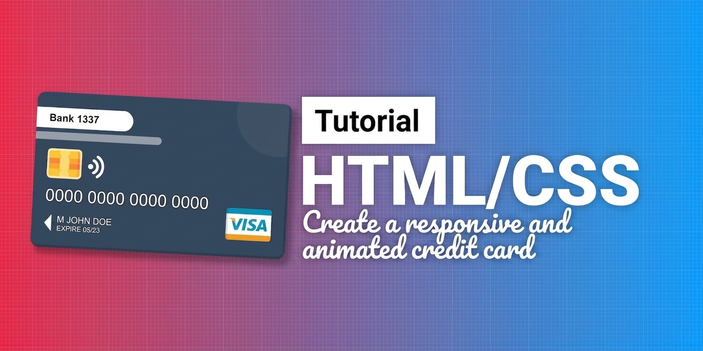
Article published on 18/06/2021, last updated on 10/08/2026
Here's a simple little tutorial to improve your HTML/CSS skills, in which I invite you to recreate a responsive and animated credit card.
Note that the tutorial does not follow the DRY (Don't Repeat Yourself) principle, in order to keep the code blocks clear and detachable from one another.
You'll find all the necessary code in the article, but I invite you to grab the whole project directly on GitHub, where you'll find the images as well as all the steps, broken down file by file.
And a demo of the final result right here: https://nicolasbrondin.github.io/tutorial-css-credit-card/
Step 0: The background
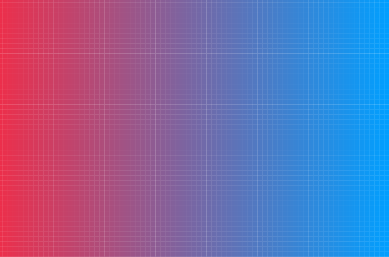
Creating a somewhat elaborate background like this one doesn't require huge knowledge, and you can go find a gradient that you apply to your html document, as well as a pattern that you apply to the body of your page.
Personally, I used Hero Pattern for the pattern and UI Gradient for the gradient.
HTML
<!DOCTYPE html>
<html>
  <head>
    <meta charset='utf-8'>
    <meta http-equiv='X-UA-Compatible' content='IE=edge'>
    <title>Tutorial - Credit Card</title>
    <meta name='viewport' content='width=device-width, initial-scale=1'>
    <link rel='stylesheet' type='text/css' media='screen' href='./css/main.css'>
  </head>
  <body>

  </body>
</html>
CSS
html {
  background: #009FFF;  /* fallback for old browsers */
  background: -webkit-linear-gradient(to right, #ec2F4B, #009FFF);  /* Chrome 10-25, Safari 5.1-6 */
  background: linear-gradient(to right, #ec2F4B, #009FFF); /* W3C, IE 10+/ Edge, Firefox 16+, Chrome 26+, Opera 12+, Safari 7+ */
}

body {
  width: 100vw;
  height: 100vh;
  background-image: url('../img/graph-paper.svg');
  background-repeat: repeat;
  padding: 20px;
  box-sizing: border-box;
  margin: 0;
}
Step 1: The shape of the card
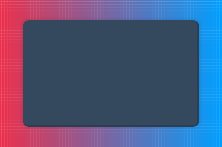
Two interesting techniques here: using flex-box to easily center our card, as well as using padding-top in percentage to always keep the same ratio for our card.
When you apply a percentage size to a padding-top, the size will be calculated based on the width of the element and not its height, which is why this makes it easy to maintain a ratio.
HTML
<div class="card-container">
  <div class="card">

  </div>
</div>
body {
  ...
  display: flex;
  justify-content: center;
  align-items: center;
}

.card-container {
  background: #34495e;
  border-radius: 20px;
  width: 100%;
  max-width: 600px;
  position: relative;
  box-shadow: 0px 0px 10px 5px rgba(0,0,0,0.1);
  border-bottom: 6px solid #2c3e50;
  border-right: 6px solid #2c3e50;
}

.card {
  position: relative;
  padding-top: 60%;
  overflow: hidden;
}
Step 2: The images
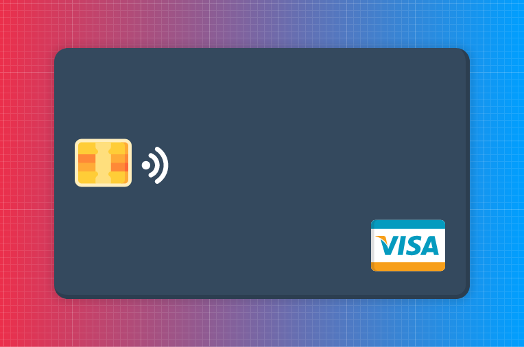
Nothing complex in this step: adding, resizing and positioning the images with percentage values to prepare for responsiveness.
HTML
<img class="chip" src="./img/chip.svg"/>
<img class="contactless" src="./img/wifi-signal.svg"/>
<img class="visa"src="./img/visa.svg"/>
CSS
.chip {
  position: absolute;
  top: 35%;
  left: 5%;
  height: 23%;
}

.contactless {
  position: absolute;
  top: 40%;
  left: 20%;
  height: 15%;
  transform: rotate(90deg);
}

.visa {
  position: absolute;
  bottom: 5%;
  right: 5%;
  height: 30%;
}
Step 3: The 16 digits
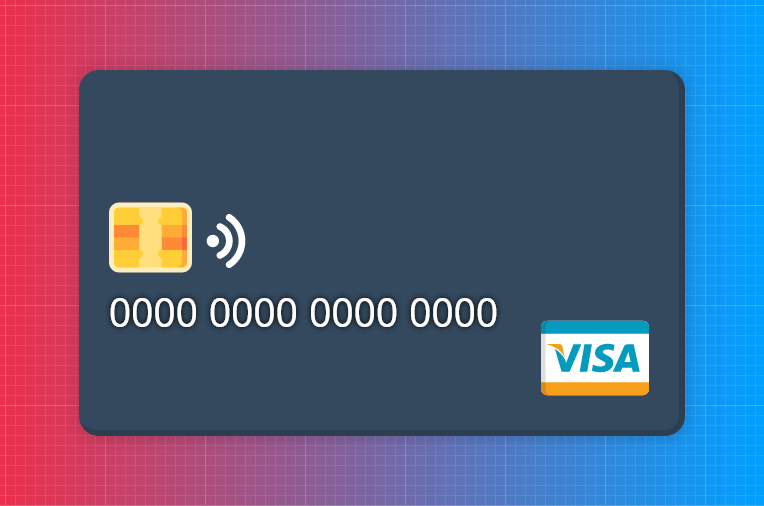
Here, using the "text-shadow" property makes the text stand out and gives a volume effect, just like on a real credit card.
HTML
<p class="card-number">0000 0000 0000 0000</p>
CSS
.card-number {
  position: absolute;
  top: 50%;
  left: 5%;
  font-size: 2.5rem;
  font-family: sans-serif;
  color: white;
  text-shadow: 0px 0px 5px black;
}
Step 4: The arrow
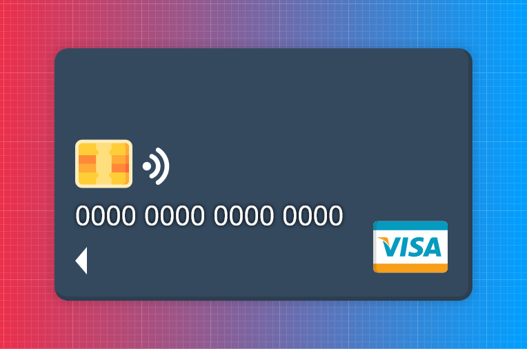
Why go looking for an icon when you can directly draw a triangle in CSS using the borders technique?
Note that there are also generators for creating these famous CSS triangles if you want to go faster.
HTML
<div class="arrow"></div>
CSS
.arrow {
  position: absolute;
  top: 80%;
  left: 5%;
  width: 0;
  height: 0;
  border-top: 20px solid transparent;
  border-bottom: 20px solid transparent;
  border-right:17px solid white;
}
Step 5: The additional information
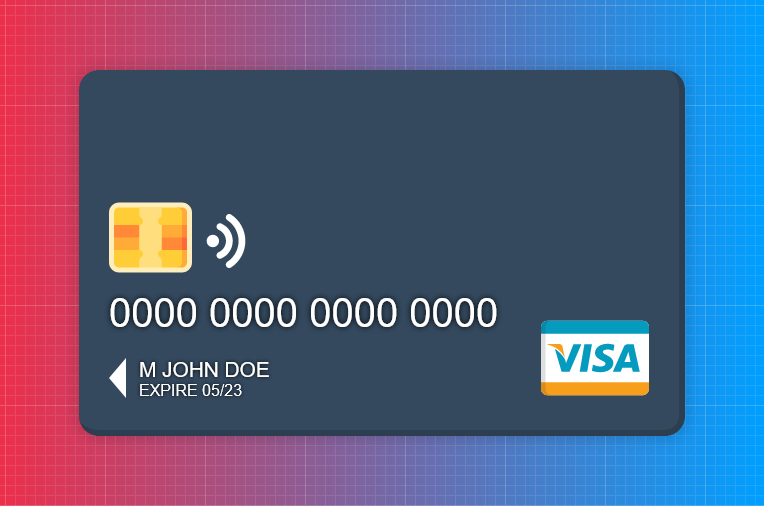
Here we use the "text-transform" property with the "uppercase" value in order to switch the entire text to capital letters, directly in the CSS, which is very handy!
HTML
<p class="card-name">M John Doe</p>
<p class="card-expire">Expire 05/23</p>
CSS
.card-name, .card-expire {
  position: absolute;
  left: 10%;
  font-family: sans-serif;
  color: white;
  text-transform: uppercase;
  text-shadow: 0px 0px 3px black;
}

.card-name {
  top: 74%;
  font-size: 1.3rem;
}

.card-expire {
  top: 82%;
  font-size: 1rem;
}
Step 6: The bank
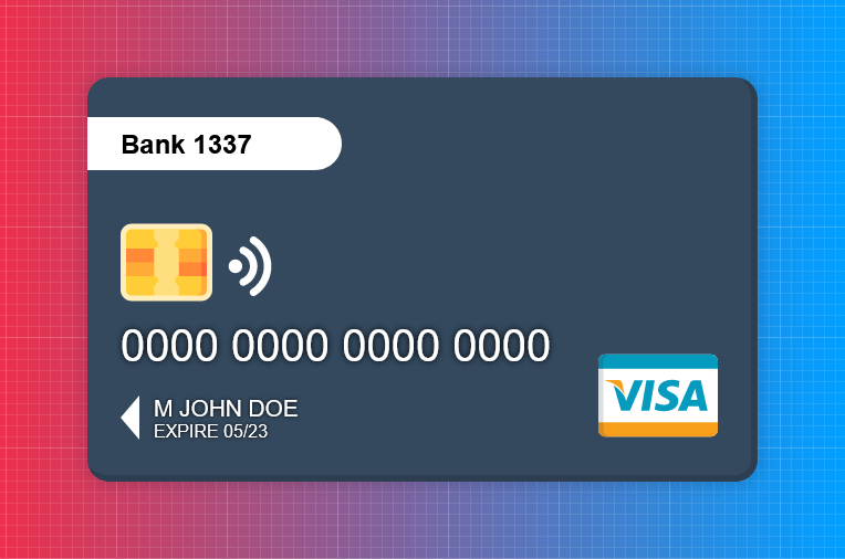
Switching a text's display from "inline" to "inline-block" means that the text will only take up the space it needs, without stretching infinitely horizontally.
HTML
<p class="bank-name">Bank 1337</p>
CSS
.bank-name {
  margin: 0;
  display: inline-block;
  padding: 10px 20px;
  padding-left: 5%;
  position: absolute;
  top: 10%;
  left: 0;
  font-size: 1.5rem;
  font-family: sans-serif;
  color: black;
  font-weight: bold;
  background-color: white;
  min-width: 30%;
  border-top-right-radius: 50px;
  border-bottom-right-radius: 50px;
}
Step 7: The decorations
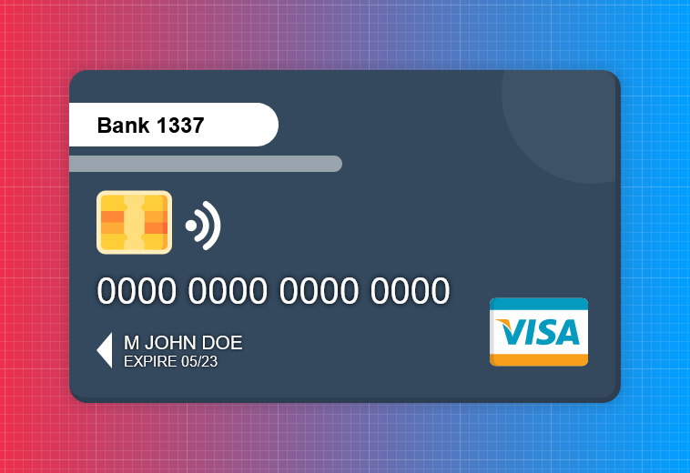
The ideal approach when you want to draw something that adds no semantic meaning to your page is to use the "::before" and "::after" pseudo-elements.
These are "virtual" elements, which only exist if you declare them in CSS; they will then be attached to your starting element (in this example, the card).
CSS
.card::before {
  content: "";
  position: absolute;
  display: inline-block;
  background-color: white;
  width: 50%;
  height: 5%;
  left: 0;
  top: 26%;
  border-top-right-radius: 50px;
  border-bottom-right-radius: 50px;
  opacity: 0.5;
}

.card::after {
  content: "";
  position: absolute;
  display: block;
  background-color: white;
  width: 200px;
  height: 200px;
  right: -75px;
  top:-75px;
  border-radius: 50%;
  opacity: 0.05;
}
Step 8: The animation
A very simple method for animating an element is to modify some of its attributes on an event (for example :hover) and to apply a transition animation to the element as a whole.
Here we play with zoom, rotation and box-shadow to create a levitation effect.
CSS
.card-container {
  ...
  transition: 0.5s transform, 0.5s box-shadow;
}

.card-container:hover {
  transform: scale(1.1) rotate(3deg);
  box-shadow: 10px 10px 10px 5px rgba(0,0,0,0.3);
}
Step 9: Responsiveness
Most of our design is nearly responsive, but a few elements (particularly the texts) need a bit of help for smaller screen sizes.
Since we used sizes in rem, we can simply vary the size of all the fonts by modifying that of the :root element, as below:
CSS
@media screen and (max-width: 580px){
  :root {
    font-size: 12px;
  }
  .bank-name {
    padding: 8px 15px;
  }
  .arrow {
    border-top: 18px solid transparent;
    border-bottom: 18px solid transparent;
    border-right:15px solid white;
  }
}

@media screen and (max-width: 460px){
  :root {
    font-size: 10px;
  }
  .bank-name {
    padding: 5px 12px;
  }
  .arrow {
    border-top: 13px solid transparent;
    border-bottom: 13px solid transparent;
    border-right:11px solid white;
  }
}

@media screen and (max-width: 360px){
  :root {
    font-size: 8px;
  }

  .card-container {
    border-bottom: 3px solid #2c3e50;
    border-right: 3px solid #2c3e50;
  }

  .bank-name {
    padding: 3px 8px;
  }

  .arrow {
    border-top: 10px solid transparent;
border-bottom: 10px sol Our newsletter
'%3e%3cpath%20fill-rule='evenodd'%20clip-rule='evenodd'%20d='M72.5155%2012.5718C75.6945%2015.8057%2078.2525%2019.5301%2080.1125%2023.679C81.3145%2026.3623%2082.3435%2029.1243%2083.4505%2031.8492C83.6375%2032.3111%2083.7765%2032.8053%2084.0355%2033.2246C84.6475%2034.2217%2085.7315%2034.5465%2086.8145%2034.1274C87.8715%2033.7195%2088.3955%2032.7253%2088.1515%2031.5451C88.0755%2031.1786%2087.9465%2030.8219%2087.8105%2030.4722C86.9775%2028.3103%2086.1515%2026.1476%2085.2915%2023.9968C83.1765%2018.7014%2080.1335%2013.9697%2076.2523%209.82479C72.7447%206.07839%2068.6287%203.12639%2063.7022%201.48819C57.4127%20-0.603812%2051.2075%20-0.547513%2044.9948%202.02189C39.4996%204.29209%2035.0439%207.73379%2031.711%2012.6458C31.5036%2012.9502%2031.2574%2013.2266%2031.0268%2013.5179C29.915%2013.4715%2028.8561%2013.3969%2027.7982%2013.3869C22.9432%2013.3447%2018.3994%2014.7386%2013.967%2016.5243C9.59841%2018.2828%205.56591%2020.6962%201.54961%2023.131C1.23141%2023.325%200.904509%2023.5281%200.643609%2023.7892C-0.0963912%2024.5355%20-0.200491%2025.6562%200.342808%2026.5603C0.828308%2027.3659%201.83521%2027.8%202.78011%2027.5321C3.25281%2027.3987%203.70351%2027.1552%204.13371%2026.9099C5.82041%2025.9496%207.49191%2024.9658%209.17171%2023.9963C13.5938%2021.4452%2018.2545%2019.5026%2023.2628%2018.4322C24.9852%2018.0641%2026.7172%2017.9384%2028.7371%2018.038C28.4581%2018.917%2028.271%2019.5699%2028.0472%2020.2096C26.67%2024.1467%2026.5267%2028.1778%2027.1522%2032.2608C27.6029%2035.2162%2028.8732%2037.7537%2031.2161%2039.6622C33.4854%2041.5118%2036.0875%2041.9447%2038.8101%2040.9617C41.0438%2040.156%2042.8658%2038.6736%2044.0441%2036.5888C46.8425%2031.6348%2047.0464%2026.603%2044.2229%2021.5701C42.7367%2018.9202%2040.5312%2017.0235%2037.8341%2015.6694C37.237%2015.3705%2036.645%2015.0612%2036.0884%2014.7741C36.1468%2014.5219%2036.1423%2014.3816%2036.2057%2014.2889C36.4175%2013.9774%2036.6413%2013.675%2036.879%2013.3854C39.3546%2010.384%2042.3928%208.17019%2045.9575%206.58539C50.4698%204.57989%2055.0793%204.08149%2059.8924%205.16149C64.8992%206.28519%2068.9941%208.99209%2072.5155%2012.5718ZM41.594%2029.1476C41.5152%2030.918%2041.1023%2032.5993%2040.1694%2034.1291C39.5697%2035.114%2038.7683%2035.8803%2037.7415%2036.3967C36.28%2037.1301%2034.9842%2036.9271%2033.7986%2035.8031C32.6715%2034.7343%2032.0038%2033.4128%2031.7388%2031.8996C31.0008%2027.6748%2031.4326%2023.5754%2033.1597%2019.6328C33.2535%2019.4133%2033.4078%2019.2186%2033.5245%2019.0287C38.275%2019.976%2041.8043%2024.4206%2041.594%2029.1476Z'%20fill='black'/%3e%3cpath%20fill-rule='evenodd'%20clip-rule='evenodd'%20d='M102.266%2020.8839C101.352%2020.2756%20100.13%2020.4026%2099.3588%2021.2292C99.0208%2021.5933%2098.7528%2022.026%2098.4788%2022.4428C96.5528%2025.3735%2094.6639%2028.3264%2092.6999%2031.2312C91.5439%2032.9398%2090.2908%2034.5849%2089.0488%2036.2335C88.6758%2036.7311%2088.2468%2037.2126%2087.7568%2037.5863C85.7018%2039.1532%2085.0969%2038.8619%2083.7259%2037.4394C82.5589%2036.2278%2081.4588%2034.9302%2080.4798%2033.5586C78.8108%2031.2187%2077.2609%2028.7911%2075.657%2026.4008C75.343%2025.9337%2075.0504%2025.4451%2074.6842%2025.0228C73.8576%2024.0693%2072.6388%2023.9134%2071.6428%2024.5858C70.7481%2025.1888%2070.4458%2026.3239%2070.908%2027.4234C71.0299%2027.7102%2071.1897%2027.9832%2071.3645%2028.2417C73.2453%2031.0478%2075.0782%2033.8887%2077.0405%2036.638C78.0899%2038.1092%2079.3228%2039.4556%2080.5508%2040.7855C81.4478%2041.7575%2082.5558%2042.4683%2083.8038%2042.9622C84.9038%2043.3991%2085.9788%2043.513%2087.1198%2043.0138C89.1478%2042.4708%2090.8458%2041.3176%2092.1638%2039.6644C93.5678%2037.9044%2094.9388%2036.1104%2096.2058%2034.251C98.3208%2031.1475%20100.341%2027.9792%20102.398%2024.8354C102.636%2024.4693%20102.888%2024.1036%20103.065%2023.7065C103.522%2022.6733%20103.169%2021.4844%20102.266%2020.8839Z'%20fill='black'/%3e%3c/g%3e%3cdefs%3e%3cclipPath%20id='clip0_1990_7380'%3e%3crect%20width='103'%20height='43'%20fill='white'/%3e%3c/clipPath%3e%3c/defs%3e%3c/svg%3e)

No spam. Only free content, news, and ever more resources to level up your skills!
 Join +1500 developers
No comments yet